Leaderboard
Popular Content
Showing content with the highest reputation on 03/02/2018 in all areas
-
Hi Mark, I’ve only painted one blaster so far, but found I had three distinct finishes, which I believe is based on the amount of top coat I added. In the picture below, you’ll see that the folding stock has a distinctly mottled effect, much more so than the barrel next to it. For this piece, I followed the same process as I was doing for all “metallic” parts of the blaster; primer > metallic silver > hammered black > Matt black. However, when I sprayed the Matt black over the hammered effect, I think I went too heavy and lost some of the hammered effect - it looked very flat and lifeless to me. So. I simply sprayed, from a distance, a light coat of hammered OVER the Matt black. That is the end finish that you now see on the folding stock. To me, it as a slight “rusted” feel to it. My favourite finish on the blaster is the end cap. I used the same coating process as before, primer > metallic silver > hammered black > Matt black, but applied a lighter top coat of Matt black. This, to me, left a much nicer finish. My least favourite part would be the main barrel, especially around the t-tracks. To get enough paint coverage in and around the t-tracks, I had to apply a thicker top coat of Matt black. As such, the hammered effect is very minimal around the front end if the blaster but does improve around the middle and rear. Hope that makes sense to a degree. In short, the quantity of top coat (applied over the hammered effect) can make a big difference. Dan. :-) Sent from my iPhone using Tapatalk3 points
-
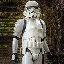
Now that I’ve had a few troops under my belt with basic clearance, I am ready to finish tackling journey towards centurion builder. This evening I’ve started the process of shimming up my kidney armor. So far so good. In the process of measuring out my shimming, I did discover a strapping issue that has had my armor out of a little bit of misalignment. I think after I get my armor shimmed up I’ll be able to get a better sense of where I need to fix the strapping. But for now I’m not quite sure. Tomorrow I will get started on filling the seam with a touch of ABS paste, blending it in, and then sanding/buffing. Sent from my iPhone using Tapatalk3 points
-
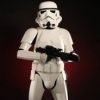
Re-gluing the thigh, added the snap plate to the chest for the shoulder strap, started the strapping and finished off the belt and TD. Sent from my VK815 using Tapatalk3 points
-
Hey everyone, as most of you have probably noticed the boards were upgraded last year, and now some of the old assets look outdated (or outright broken). We also can't find the source files for a lot of them, so long story short, I've been tasked by Paul (Daetrin) with doing a refresh on the various icons/awards/etcetera peppering the boards. This thread is to serve as a PSA as well as for gathering feedback from the membership. I have two goals in mind with this refresh : 1. Hi-Res assets - with the explosion of super-high PPI displays we want to future-proof by creating any new art at higher resolution (this also opens the door to potential print and other uses down the road). 2. Streamlining/Consistency - All of the art has been made over the course of several years by multiple people, so what exists right now isn't as consistent as it could be. I'll do my best to get everything to 'gel' together better. Where possible, I will show the new images in regular and 2X (hi-res) versions. Before I dive in, a brief detour into some of the consistency stuff, namely color... there has been an attempt to clean up the "color coding" going on with user ranks and the various awards and other art that tie into them. Here's a brief run-down of the colors I'm using and where they come from: (I may eventually go through the effort of converting these over to Pantone colors, but it's a lot of work so this will suffice for now.) User Rank Images These are the first thing I will be tackling, and the new (proposed) art addresses a few issues. The "classic" FISD logo has been replaced with a (revised) beret flash, AKA the simplified shield logo. This has the benefit of looking better at smaller resolutions as well as being more OT/FO TK agnostic (no helmet!) - a goal of the detachment this year is to make FO TK's feel more at home so I'll be doing my best to help where possible. I am also switching to the same font used in the forum header (logo) for consistency. These are the proposed user title graphics - there is now a "Guest" title which we may or may not use, but completes the set of user groups in current use: Updated Red 7/1/2021 Added 8/1/2021 -- Updated 9/1/2021 -- Service/Achievement Ribbons (Part I) Much like the user titles, we can't find the original files and they had to be re-drawn. The current ones are ever-so-slightly off-center, which I will be fixing: First off, I'm proposing some slight color tweaks to the ribbon colors themselves in the interest of consistency: The Achievement Award Ribbon's center blue strip has been adjusted to match the "official" FISD blue (it also stands out better on the dark gray forum background): The Service Award Ribbon's center lilac strip has been changed to the staff "burple", this way both Admins (Red) and Staff ("Burple") are represented: The ribbons have been redrawn at high res, and the stars have been redone to match the new user titles: Next up will be tackling the other two ribbons (Master Armorer and Attaché Achievement)... stay tuned.


 2 points
 -
Hey Mark, maybe try some ultra fine sand paper on that black paint of your test pieces. This could highlight the texture again and might lead to a satisfying result... If that does not work, I keep my fingers crossed for your test with the Tamiya paint. I found their type of spray cans to have different atomizers than other spray cans. Meaning, it provides a much finer "spray fog" than all other cans I ever used. This could help to get a very thin layer of black onto your textured surface.2 points
-
So, I've got a couple of tests to share. Sorry the photos aren't the best... Ok, my first sample is the Silver Tremclad Hammer paint. I did 3 light coats about 15 minutes apart. This was the first one I painted, maybe a week ago. I liked the look of this one. A dimpled/pitted finish. But once I hit it with a light coat of Testors Matte Black, the detail was gone. The surface just wasn't textured enough to survive. The next one was the Rust-oleum Hammer Paint, Antique Pewter. Again, 3 light coats, 15 minutes apart. I had painted a scrap of this a few days ago and I hit this one with a really light coat of Testors Matte Black. A bit of the texture remained, but not a whole lot. I think I'd like to test the Tamiya Matte Black as well to see if it applies any thinner. Maybe it will preserve more of the surface detail from the hammered paint. I used the Tamiya Matte Black for the counter and power cylinders, but I think I'd call it more of a satin finish rather than a true matte so I was leaning away from using it for the receiver. More tests to follow.... Mark2 points
-
Just released on their site - check it! It will be interesting to see how it pans out. This has been in development for some time - great to see it now being offered up. https://www.anovos.com/products/star-wars-imperial-stormtrooper-armor-kit-replacement-parts1 point
-
Hi everyone, I’m sharing the following on behalf of the wife of one of our UKG sandies. Ryan’s wife Lucy has been diagnosed with lung cancer and a justgiving page has been setup to aid her treatment. https://www.justgiving.com/crowdfunding/ryanlucybigc?ref=pageredirect If anyone can spare a donation, no matter how large or small, it would be greatly appreciated by the family. Admins - If this sort of post is not allowed, or is the wrong section of the forum, please feel free to amend or remove. Best wishes. Dan1 point
-
1 point
-
I would remove the background from the first order cog, example below1 point
-
Just ordered and paid for ”torso” and as stated it should ship in 10-14 workdays...well let’s see Edit: I’m not going to mix-and-match it with any of my TM suits - that just wouldn’t be right1 point
-
Brackets on the butt plate return and bottom kidney today! Here's what the top of the butt plate looks like before I cleaned up the returns. I wanted to install the brackets first before reducing the return widths, just to make sure that the brackets would fit. Everything turned out well, so I slimmed down the returns on the butt plate and the kidney, and finished assembling the brackets together. Looks good to me! I decided to quickly install the twin snaps at the bottom of the butt plate to finish up (not much time to work on this today!). I'll get to removing all that velcro soon. I'll be installing the kidney split rivets next.1 point
-
For the record and off topic great to see you back Tim1 point
-
Later tonight i will upload the back and yolk plus show all the parts i have finished. I still need to glue a couple of minor parts, i also need to get both belts and gloves to finish the kit off. Lastly i will see if he wants to paint it or if i am just going to hand paint on the black details.1 point
-
Okay... Fully caught up. I have two points, more for consideration and discussion than anything else really: 1. Only military unit awards have the frames. Individual awards do not. Having said that, the frames are sharp looking, and Ooooooh, Shiny! 2. Where we have EIB/Centurion under the awards, perhaps put an Imperial Cog on the left and a FO Cog on the right. We are trying to ensure that both are represented, and there are indeed EIB/Centurion awards available for both sets of costumes. Ensuring that both are there provides one award for EIB, and one for Centurion, instead of the two that will inevitably be asked for when more FO troopers begin earning their awards.1 point
-
@Ruthar I measured the biceps again and yes, the left one was about 12 mm wider than the right one. It was on account of the bicep shim I had made previously. So I removed the shim and reglued and they are equal in size now. Thanks again for the input!1 point
-
Yes. I should have said between the ab return edge and your body. Thank for your response. I figured I didn't want to make it too tight to allow future expansion...of myself.1 point
-
So, just to be clear, the chest piece is intended to overlap the ab. You shouldn't need to be trimming the top of the ab past the rough trim lines. As far as fitting, I try to use the "two fingers" rule. If you can fit two fingers between your body and armor, you should be fine. That said, I'm a big believer in sizing things a touch large - you can always trim later or add foam padding to help fit - this allows for some weight gain from time to time.1 point
-
Thanks. My ask then is on the update thread for march to add this in with text such as Currently Change to As the wording really needs to be solid for us to make this change. Also, since there is L1/L2/L3 in there, you can also recommend at what level you want this change, and how it affects the rest.1 point
-
I don’t see why fabric or something thin like blue painters tape(which we believe may have been used on screen) couldn’t be used? At least for basic approval until we can find more information. I agree that fabric would work great for fans and it would be really nice to utilize the tube stripes for what they were initially intended to look like; vents. And blue painters tape would work great for sound system speakers. Actually I’m wondering if the same thing can’t be done for the Tears and Traps with black fabric, allowing actual vents in the dome and face. Imagine heat and condensation actually escaping a stormtrooper bucket, that’s now a potential possibility with the new Rogue One design. Sent from my iPhone using Tapatalk1 point
-
No worries Dan - in the 501st section this is perfectly fine. We only get twitchy and double check a bit on the open boards.1 point
-
Hi guys, Just wanted to thank everyone for their input. I went along to a local garrison armor party and had them take some photos and clean up a few minor things. For anyone interested here are the photos - now I am just waiting on approval (told there would be a delay due to 501st Elections)1 point
-
Corrections made... 1. Straightened my lines , fixed bells and the shoulder strap.. 2. Hovi mic tips white all the way to edge (waiting on paint to dry to replace screens) 3. Turn my magazine around.. 4. Drop boxes flushed with edge and edges 45* hard angles1 point
-
Congratulations trooper1 point
-
Also your letter with the missing screws arrived today, Tino! Cheers for that again! I'll hopefully get something else done over the weekend1 point
-
Weird that the torso costs the same as an arm or a leg (there's a joke in there somewhere).1 point
-
Or, this? It will take us to 2026, at the earliest. 1 - no stars 2 - 1 bronze 3 - 2 bronze 4 - 3 bronze 5 - 1 silver 6 - 1 silver, 1 bronze 7 - 1 silver, 2 bronze 8 - 1 silver, 3 bronze 9 - 2 silver 10 - 1 gold 11 - 1 gold, 1 bronze 12 - 1 gold, 2 bronze 13 - 1 gold, 3 bronze 14 - 2 gold, 1 silver 15 - 3 gold 16 - 3 gold, 1 bronze 17 - 3 gold, 2 bronze 18 - 3 gold, 3 bronze 19 - 3 gold, 4 bronze 19 - 3 gold, 1 sliver 20 - 4 gold For EI, your ascii would work. Unless we ever have > 15 costumes, we should be good.1 point
-
I'm drooling over here.1 point
-
Hey Brien - can we break out the skin updates separately? I think that may be a place where can chat about themes, maybe a "part 2". I'd like to get the badges done in one thread so after posting it can archive and we can then tackle the other design elements next.1 point
-
How exciting! I built my first TK Stunt back in 2017, and then I rebuilt my brothers botched TK for him over the new year. Feel free to ask lots of questions so that you can hopefully avoid some of the mistakes we made! Or at least the ones that I made haha!1 point
-
Suggestions - non-award related. 1.) Add some more Star Wars iconography to the forum skin, an easy replacement would be the read/unread icons: ...or FOTK inclusive version (design credit for split symbol goes to gmrhodes)?: 2.) Consider adding the logo/some color to the header?: (blurry logo because I can't find the new one)1 point
-
Quick detour to the EIB/Centurion Awards... Expert Infantry Badge So this one really doesn’t need much, if anything... so what follows is what I’d deem nice-to-haves/suggestions. The changes I'm proposing are: 1.) Lighten the "EXPERT INFANTRY" text so you can read it on the dark gray forum background. At a minimum I would say this is a must. 2.) Tweak the styling to match the new ribbons (shadows, rounded corners by popular demand). 3.) Ditch the cogs on either side of the "EXPERT INFANTRY" text. #1, as part of ongoing FOTK inclusion, and #2 because they are indistinguishable at that size. Also allows more room for text (legibility wins!). 4.) Switch the font to the one used in official FISD merchandise (most notable use is on challenge coins), it's a move towards better brand cohesion AND it's more legible scaled down (the 'R' and 0-9 most notably). 5.) Move the stars inside the EI badge instead of above it. Takes up less space (the current solution leaves a huge gap between awards), and makes it clear the stars are for the EI award and not whatever award sits above it. Also looks cooler (my opinion of course!). Proposed NEW EIB art: Centurion would follow suit with similar changes (in progress).1 point
-
Nice work good luck with approval1 point
-
Wow, I'm blown away. This is one of the best posts I've read in a long time, and your professionalism really shows. I'm surprised no one else has chimed in, but for myself I can't find anything you've suggested that I disagree with, or can think of a way to improve. The ribbons in theory should be square, but I think the slightly round looks better on a computer screen and adds depth.1 point
-
As many of you know, the 501st elections have come to a close. The FISD membership has spoken. Congratulations to our 2018 FISD Detachment Leader Paul (Daetrin)!!!!1 point
-
Congrats sir. The votes were tighter that I thought they would be. What I want to know is what are so many people disgruntled about with the current staff?1 point
-
We have a lift of! But Anthony - hurry up and start a new topic here! https://www.whitearmor.net/forum/forum/193-request-tk-pre-approval/1 point
-
I think my wife would kill me if I decided to mass produce kits but I'd be happy to provide advice and a shopping list to create suspenders, snap points and straps. Sent from my iPhone using Tapatalk1 point