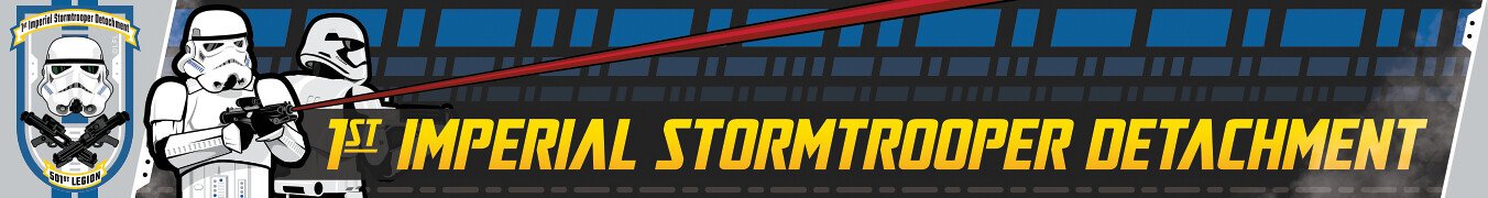
Daetrin[Admin] Posted July 20, 2006 Report Share Posted July 20, 2006 One other thing we need before we can turn in our app to the Legion is a logo for the detachment. While people are thinking about names is a great time also to start thinking about what logo you want to represent us. What do you guys think? Quote Link to comment Share on other sites More sharing options...
TK1927[501st] Posted July 21, 2006 Report Share Posted July 21, 2006 I think it's easy...you have to include a clean TK face pic....If I come up with some thing I'll throw it in. Quote Link to comment Share on other sites More sharing options...
V'Pier[501st] Posted July 21, 2006 Report Share Posted July 21, 2006 Here's what? whatever you tried to post aint working Quote Link to comment Share on other sites More sharing options...
TK4205 Posted July 21, 2006 Report Share Posted July 21, 2006 Here's what? whatever you tried to post aint working Is there a trick to posting pics here? I guess I can try it again. once more... Quote Link to comment Share on other sites More sharing options...
V'Pier[501st] Posted July 22, 2006 Report Share Posted July 22, 2006 Not bad, but we're not Stormfront.net, and I believe that's because of it's KKK connections. Quote Link to comment Share on other sites More sharing options...
Daetrin[Admin] Posted July 22, 2006 Author Report Share Posted July 22, 2006 Not bad, but we're not Stormfront.net, and I believe that's because of it's KKK connections. Yup. I updated the application to be "Stormtrooper Detachment". Unless there is an overwhelming need to change it, I think it will work. Stormtrooper alone still sounds cool after all. Quote Link to comment Share on other sites More sharing options...
TD2802[501st] Posted July 22, 2006 Report Share Posted July 22, 2006 Its almost tempting to hijack the names used by some of those fringe groups that thrive on low self-esteem and ignorance. If it weren't for SW, 'stormtrooper' would probably still be associated with the Third Reich in a lot of people's minds. Just goes to show how terms with heavy political/historical baggage can be transformed in the public's perception Quote Link to comment Share on other sites More sharing options...
TK4205 Posted July 26, 2006 Report Share Posted July 26, 2006 Here's a template. If we like it, we can put the name in later. Quote Link to comment Share on other sites More sharing options...
TK4205 Posted July 26, 2006 Report Share Posted July 26, 2006 Here's a template. If we like it, we can put the name in later. Well, what do we think? Quote Link to comment Share on other sites More sharing options...
Butah Fett Posted July 26, 2006 Report Share Posted July 26, 2006 It's kind of bland, kind of like a toned down version of the legion logo. What about that tribal cog someone posted before? That was original looking. Quote Link to comment Share on other sites More sharing options...
TD2802[501st] Posted July 27, 2006 Report Share Posted July 27, 2006 I like the design personally. A simple design can be menacing and belies the discipline and mercilessness of what a TK is without having to rely on a lot of visual gimmickry or flash. Quote Link to comment Share on other sites More sharing options...
Butah Fett Posted July 27, 2006 Report Share Posted July 27, 2006 It just seems so monochromatic. Maybe add just a bit of color? Maybe some blue as a contrast to the red of the Legion logo? Quote Link to comment Share on other sites More sharing options...
Daetrin[Admin] Posted July 28, 2006 Author Report Share Posted July 28, 2006 The tribal's over on the t-shirt contest thread. If someone wants nominate it here for consideration for a detachment logo, it would give us another choice to vote for. Quote Link to comment Share on other sites More sharing options...
TK4205 Posted July 28, 2006 Report Share Posted July 28, 2006 I don't want to seem biassed, but how does "tribal" say "stormtrooper"? I personaly like the tribal cog, but IMHO it belongs tattooed on someones back, and most likely is. Quote Link to comment Share on other sites More sharing options...
CooR[TK] Posted July 29, 2006 Report Share Posted July 29, 2006 IMHO a full TK's pic should have an E-11 in any logo, shirt or patch. Quote Link to comment Share on other sites More sharing options...
Exodus[TK] Posted July 30, 2006 Report Share Posted July 30, 2006 Good point about the E-11. Quote Link to comment Share on other sites More sharing options...
TK4205 Posted July 31, 2006 Report Share Posted July 31, 2006 I certainly don't want my logo to win just by default, but so far it's the only one that's been submited to this thread. Who did the tribal cog? do we have permission to use it? Most of all, do we have permission to change it? I know I feel when my own work is cut and pasted in photoshop. All my work is original. Not bits of stuff found on the net and cut and pasted to change. I think that this is the same case as our board naming issue in that you can only please some of the people some of the time. Quote Link to comment Share on other sites More sharing options...
Exodus[TK] Posted July 31, 2006 Report Share Posted July 31, 2006 Folks, Please keep the thread free of any derogatory statements towards sexual preference, race, or religion on the boards. We do not want offend any members and / or have our detachment application disapproved due to misconduct on the boards. Please direct any questions directly to me in a PM. Thx, Ed Quote Link to comment Share on other sites More sharing options...
Daetrin[Admin] Posted July 31, 2006 Author Report Share Posted July 31, 2006 FYI I thought having a Mando slogan on the design might: 1) Make it look more like a military patch, such as the 2nd ACR's "Toujours Pret" 2) Tie in to the Mando continuity established by Karen Traviss from Mando-ARC-TC (and from there to TK). 3) Be a great alternative to English text, or even English in Arebush I took the liberty of emailing Karen Traviss on her thoughts, her reply is below: How about "Darasuum" (eternal) or "Darasuum ruusaanyc" (always reliable, which is the equivalent of semper fi.) I'll have another think. But those two strike me as useful. Loyal, by the way, is verburyc. Quote Link to comment Share on other sites More sharing options...
TK4205 Posted July 31, 2006 Report Share Posted July 31, 2006 FYI I thought having a Mando slogan on the design might: 1) Make it look more like a military patch, such as the 2nd ACR's "Toujours Pret" 2) Tie in to the Mando continuity established by Karen Traviss from Mando-ARC-TC (and from there to TK). 3) Be a great alternative to English text, or even English in Arebush I took the liberty of emailing Karen Traviss on her thoughts, her reply is below: The bottom of my logo says "first ones in last ones out" for those of you who don't read Arebush. Quote Link to comment Share on other sites More sharing options...
CooR[TK] Posted July 31, 2006 Report Share Posted July 31, 2006 I think the tribal cog with 2 E-11 across it and a bucket in front of that, kinda like a take off of the bucket and crossbones would really stand out. I agree, that one gets my vote Quote Link to comment Share on other sites More sharing options...
TK4205 Posted July 31, 2006 Report Share Posted July 31, 2006 I agree, that one gets my vote Well, let's see it. Or are we going to just vote on tentative ideas? Quote Link to comment Share on other sites More sharing options...
Daetrin[Admin] Posted July 31, 2006 Author Report Share Posted July 31, 2006 (edited) You kill me! I had just cobbled something similar and was about to post. Ugh - I could have kept working and just posted comments to yours. :-p ---------------- I like your overall artwork better, but here the one item I was trying to address is this: most of the designs are probably too complicated to have made into patches. In order to simplify, perhaps try: -> Use the outlines of the blasters. -> use a simpler type of helmet - perhaps just the outline of the dark areas like the CTN splash image -> I was also using Infantry Blue as a nod to US troops (my own addition) I know some hate it but I still like the cog as a design element. Perhaps just using a single circle as an outside border? I took a look at a lot of Army patches and noted that some of the best ones (IMO) are simple, like Special Forces and the 10th Mountain. Perhaps we should just use either the blasters or the helmet, but not both. Thoughts? Edited June 24, 2021 by gmrhodes13 link not working, removed gmrhodes13 2021 Quote Link to comment Share on other sites More sharing options...
Butah Fett Posted July 31, 2006 Report Share Posted July 31, 2006 I think we should just have a blaster in there, no helmet. Quote Link to comment Share on other sites More sharing options...
Daetrin[Admin] Posted August 4, 2006 Author Report Share Posted August 4, 2006 As this is the last thing we need before turning in our application I'd like to close this up sooner than later. I'll close this thread on Friday 11AUG and we'll vote against what's been submitted by that time. Quote Link to comment Share on other sites More sharing options...
Recommended Posts
Join the conversation
You can post now and register later. If you have an account, sign in now to post with your account.