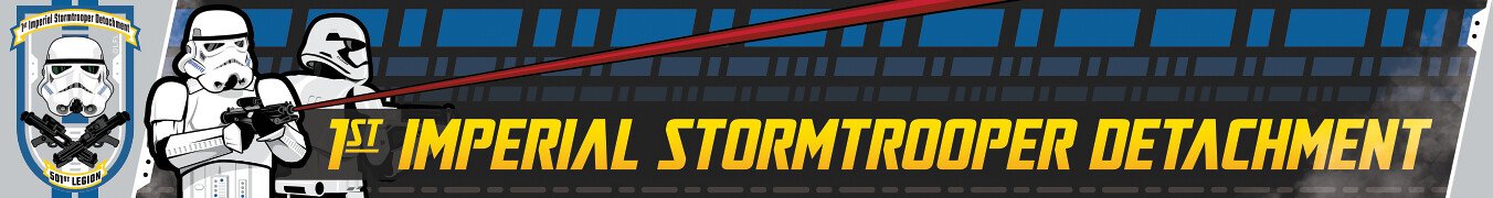
Daetrin[Admin] Posted March 3, 2018 Report Share Posted March 3, 2018 46 minutes ago, gmrhodes13 said: I would remove the background from the first order cog, example below I'm also agreed that having both is a smart move. It may upset some purists, but I think long term it's the right thing to do. 1 Quote Link to comment Share on other sites More sharing options...
Dark PWF[Staff] Posted March 3, 2018 Report Share Posted March 3, 2018 4 hours ago, ukswrath said: For the record and off topic great to see you back Tim Thanks Tony, it is indeed good to be back. 1 Quote Link to comment Share on other sites More sharing options...
Harbinger[IPM] Posted March 3, 2018 Author Report Share Posted March 3, 2018 1 hour ago, Daetrin said: I'm also agreed that having both is a smart move. It may upset some purists, but I think long term it's the right thing to do. Yes and that looks pretty good scaled down, I’ll make the change(s). Quote Link to comment Share on other sites More sharing options...
ukswrath[Staff] Posted March 3, 2018 Report Share Posted March 3, 2018 1 hour ago, Daetrin said: I'm also agreed that having both is a smart move. It may upset some purists, but I think long term it's the right thing to do. After that last election we still have purists? Quote Link to comment Share on other sites More sharing options...
T-Jay[TK] Posted March 3, 2018 Report Share Posted March 3, 2018 (edited) Hats off to all the work done already. I am fine with almost everything so far and whatever will be chosen at the end, will surely look superb. The only thing that I am worrying about, is the design of the shown imperial cog: On 28.2.2018 at 1:30 AM, Harbinger said: Not sure how to explain, the web is full of imperial cogs with many variations but there is only one correct design. The width of the six "inner spokes" and the six "outer slots" seem wrong to me. This affects every graphic, where this cog has been copied into. Sorry to mention that, it is not meant in any negative way. As you can see in my avatar picture, I just really love that thing and feel connected to it. Oh, talking about changing graphics on FISD: some of our smilies are still outlined with white pixels (from when we had the white background). Maybe this can get fixed someday... Edited March 3, 2018 by T-Jay Quote Link to comment Share on other sites More sharing options...
gmrhodes13[Staff] Posted March 3, 2018 Report Share Posted March 3, 2018 3 minutes ago, T-Jay said: The only thing that I am worrying about, is the design of the shown imperial cog: Not sure how to explain, the web is full of imperial cogs with many variations but there is only one correct design. The width of the six "inner spokes" and the six "outer slots" seem wrong to me. This affects every graphic, where this cog has been copied into. Sorry to mention that, it is not meant in any negative way. As you can see in my avatar picture, I just really love that thing and feel connected to it. I know from my own experience I have had to widen sections of both the imperial and first order cogs for them to be viewable on small graphics otherwise they just get merged together. Quote Link to comment Share on other sites More sharing options...
TheSwede[TK] Posted March 3, 2018 Report Share Posted March 3, 2018 Still going on about the FISD logo, I think this helmet design would be great to use with the crossed blasters...not having a helmet just feels wrong. 1 Quote Link to comment Share on other sites More sharing options...
T-Jay[TK] Posted March 3, 2018 Report Share Posted March 3, 2018 How to proceed with that logo, if we should get another trilogy (episodes X-XII) with again different stormtrooper designs?! Quote Link to comment Share on other sites More sharing options...
TheSwede[TK] Posted March 3, 2018 Report Share Posted March 3, 2018 2 minutes ago, T-Jay said: How to proceed with that logo, if we should get another trilogy (episodes X-XII) with again different stormtrooper designs?! Good point, I have no answer to that other than I really would prefer an iconic stormtrooper helmet to be displayed in the logo of the First Imperial Stormtrooper Detachment Quote Link to comment Share on other sites More sharing options...
Harbinger[IPM] Posted March 3, 2018 Author Report Share Posted March 3, 2018 You know the logo for the ranks isn’t the actual logo right? Its the beret flash. The logo is not changing... Quote Link to comment Share on other sites More sharing options...
Harbinger[IPM] Posted March 3, 2018 Author Report Share Posted March 3, 2018 (edited) 10 minutes ago, T-Jay said: How to proceed with that logo, if we should get another trilogy (episodes X-XII) with again different stormtrooper designs?! We’ve got a good 5 years (at least, please, Disney!) before we need to worry about that but it is something to think about. Edited March 3, 2018 by Harbinger Quote Link to comment Share on other sites More sharing options...
TheSwede[TK] Posted March 3, 2018 Report Share Posted March 3, 2018 1 minute ago, Harbinger said: You know the logo for the ranks isn’t the actual logo right? Its the beret flash. The logo is not changing... Ahh, good to know *phue* ...but still....the ranks would look better with the helmet-thing Quote Link to comment Share on other sites More sharing options...
Harbinger[IPM] Posted March 5, 2018 Author Report Share Posted March 5, 2018 (edited) Okay, gave the half-and-half helmet a try, IMO its a step backwards as its just a blurry mess of pixels (non-half OT is still as bad): Went back and updated my Empire/FO symbols, made some tweaks so it would look better at smaller sizes: vs old: I've also made a dark text variant for white backgrounds: Thanks for the feedback everyone. Edited March 6, 2018 by Harbinger Quote Link to comment Share on other sites More sharing options...
Harbinger[IPM] Posted March 6, 2018 Author Report Share Posted March 6, 2018 (edited) Centurion and Attache awards have been updated with both logos as well: Lastly, while I doubt we'll ever see achievement award levels 16+, here's a framed version for if/when it ever happens: Edited March 6, 2018 by Harbinger Quote Link to comment Share on other sites More sharing options...
gmrhodes13[Staff] Posted March 6, 2018 Report Share Posted March 6, 2018 What about removing the centre of the FO cog, looks much better without it. Quote Link to comment Share on other sites More sharing options...
Harbinger[IPM] Posted March 6, 2018 Author Report Share Posted March 6, 2018 (edited) The print version has one like your image, I had to simplify for the forum versions: The other versions look really messy when scaled down to these sizes. Edited March 6, 2018 by Harbinger Quote Link to comment Share on other sites More sharing options...
gmrhodes13[Staff] Posted March 6, 2018 Report Share Posted March 6, 2018 Actually thought the version you posted looked messy, oh well must just be my eyes Quote Link to comment Share on other sites More sharing options...
Daetrin[Admin] Posted March 6, 2018 Report Share Posted March 6, 2018 Hey Brien - these are gorgeous! I can't wait to get 'em posted. Quote Link to comment Share on other sites More sharing options...
CableGuy[Admin] Posted March 16, 2018 Report Share Posted March 16, 2018 (edited) Hi all, Is there an open section on the forum where these awards/ribbons are explained? I'm thinking, if a new member signs up and sees ribbons and awards, etc, what would be the easiest way for them to look them up? Giving them something to aspire to and give them confidence in the advise that they are receiving. Perhaps when one hovers over a ribbon or award, a brief description could be displayed? "Centurion - awarded for the highest level of screen accurate armor" for example... Or, clicking on any award takes a person through to a list of what the awards mean. Now, for those awards with writing under them, a member could search the forum. For those ribbons with just colours, what does each one mean to an aspiring Stormtrooper? Whilst they look beautiful, it might be nice to know what that member has achieved. Just a thought. :-) Edited March 16, 2018 by CableGuy 1 Quote Link to comment Share on other sites More sharing options...
T-Jay[TK] Posted March 16, 2018 Report Share Posted March 16, 2018 32 minutes ago, CableGuy said: (...) Just a thought. :-) ...and not a bad one. Years ago I also wondered, if it wouldn't make sense to have a thread in the "Getting Started" or "Tech Support" section, that works like a user manual for our FISD. You know, something to explain not only the simple options like Edit, Quote and Multiquote. But also to demonstrate how to correctly mention a member in a text, so that this person is being notified. To inform, that a simple reply to somebody's text, is not a guarantee the person will ever read it (unless using the quote option or the person is already following). And more difficult things like how to quote postings from various threads and reply to that in a different one. How to compress or hide definded rows in a text, that only expand when clicking that area. And what Dan suggested could also be included into this thread. As well as the listing, of how the name above the avatar picture changes, depending on the amount of posts or achievements. And I am sure there would be more things to incorporate, which I haven't thought of right now. Any user should be aware of all the technical options when using this board. Just an idea... 2 Quote Link to comment Share on other sites More sharing options...
wook1138[TK] Posted March 16, 2018 Report Share Posted March 16, 2018 3 minutes ago, T-Jay said: ...and not a bad one. Years ago I also wondered, if it wouldn't make sense to have a thread in the "Getting Started" or "Tech Support" section, that works like a user manual for our FISD. You know, something to explain not only the simple options like Edit, Quote and Multiquote. But also to demonstrate how to correctly mention a member in a text, so that this person is being notified. To inform, that a simple reply to somebody's text, is not a guarantee the person will ever read it (unless using the quote option or the person is already following). And more difficult things like how to quote postings from various threads and reply to that in a different one. How to compress or hide definded rows in a text, that only expand when clicking that area. And what Dan suggested could also be included into this thread. As well as the listing, of how the name above the avatar picture changes, depending on the amount of posts or achievements. And I am sure there would be more things to incorporate, which I haven't thought of right now. Any user should be aware of all the technical options when using this board. Just an idea... Yes to this! I had never been a part of an online forum before this. I wasn't even on Facebook. Researching and building my first TK was a steep learning curve one its own- navigating a forum for the first time was another learning curve for me. Yeah, I'm old and out of touch - but I'm sure I'm not alone. A pinned thread or post that compiles all this info would be awesome! 2 Quote Link to comment Share on other sites More sharing options...
ukswrath[Staff] Posted March 16, 2018 Report Share Posted March 16, 2018 1 hour ago, CableGuy said: Hi all, Is there an open section on the forum where these awards/ribbons are explained? I'm thinking, if a new member signs up and sees ribbons and awards, etc, what would be the easiest way for them to look them up? Giving them something to aspire to and give them confidence in the advise that they are receiving. Perhaps when one hovers over a ribbon or award, a brief description could be displayed? "Centurion - awarded for the highest level of screen accurate armor" for example... Or, clicking on any award takes a person through to a list of what the awards mean. Now, for those awards with writing under them, a member could search the forum. For those ribbons with just colours, what does each one mean to an aspiring Stormtrooper? Whilst they look beautiful, it might be nice to know what that member has achieved. Just a thought. :-) Oh heck yea, this would be awesome. Can't tell you how many times I've hovered my mouse over the bars just to see if something new would appear lol. Would that be the definition of insanity? 1 hour ago, T-Jay said: ...and not a bad one. Years ago I also wondered, if it wouldn't make sense to have a thread in the "Getting Started" or "Tech Support" section, that works like a user manual for our FISD. You know, something to explain not only the simple options like Edit, Quote and Multiquote. But also to demonstrate how to correctly mention a member in a text, so that this person is being notified. To inform, that a simple reply to somebody's text, is not a guarantee the person will ever read it (unless using the quote option or the person is already following). And more difficult things like how to quote postings from various threads and reply to that in a different one. How to compress or hide definded rows in a text, that only expand when clicking that area. And what Dan suggested could also be included into this thread. As well as the listing, of how the name above the avatar picture changes, depending on the amount of posts or achievements. And I am sure there would be more things to incorporate, which I haven't thought of right now. Any user should be aware of all the technical options when using this board. Just an idea... Excellent ideas 54 minutes ago, wook1138 said: Yes to this! I had never been a part of an online forum before this. I wasn't even on Facebook. Researching and building my first TK was a steep learning curve one its own- navigating a forum for the first time was another learning curve for me. Yeah, I'm old and out of touch - but I'm sure I'm not alone. A pinned thread or post that compiles all this info would be awesome! Here's to old dudes Cheers 3 Quote Link to comment Share on other sites More sharing options...
Daetrin[Admin] Posted March 16, 2018 Report Share Posted March 16, 2018 @Ripper_L or @Harbinger - lmk if either of you want to grab this or need help - it's a good idea. Quote Link to comment Share on other sites More sharing options...
Harbinger[IPM] Posted March 16, 2018 Author Report Share Posted March 16, 2018 Well you or Mathias would need to add mouseover text, as for a ‘forum how-to’ keep the suggestions coming on what you all want to see. Quote Link to comment Share on other sites More sharing options...
Daetrin[Admin] Posted March 16, 2018 Report Share Posted March 16, 2018 5 minutes ago, Harbinger said: Well you or Mathias would need to add mouseover text, as for a ‘forum how-to’ keep the suggestions coming on what you all want to see. OK, I think I added it right. Try it now and lmk what I missed for mouseover text. Quote Link to comment Share on other sites More sharing options...
Recommended Posts
Join the conversation
You can post now and register later. If you have an account, sign in now to post with your account.