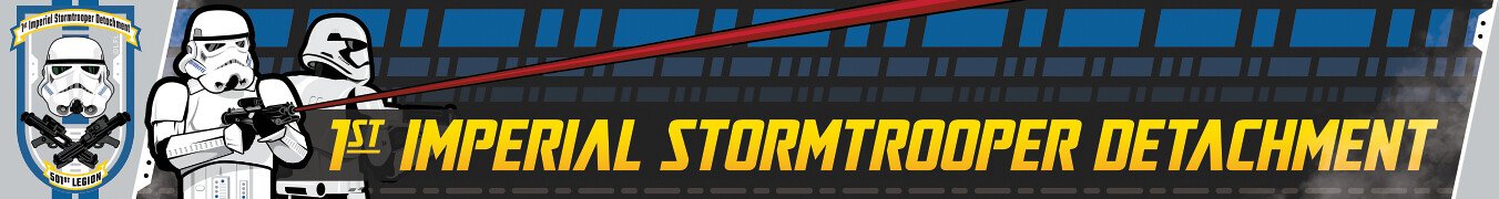
Daetrin[Admin] Posted May 17, 2011 Report Share Posted May 17, 2011 All - given how many pains we've had with our existing skin I loaded a new one that should be defect free. You can see it by changing your skin on the bottom left of the page to FISD 2011. So far it tests correctly in IE7 and IE9, but there will be some CSS tweaks needed for IE8 & FF3.6. Also on our list is to change the red to blue - else we look too much like the SLD I'll be making this the default skin by the end of the month, so if you find any other items that need changing, please shout it out. Quote Link to comment Share on other sites More sharing options...
Locitus[Admin] Posted May 17, 2011 Report Share Posted May 17, 2011 It looks like crap in Chrome 11.0.696.68, just FYI. But I do appreciate the effort you make to give us new skins. Quote Link to comment Share on other sites More sharing options...
Sonnenschein Posted May 17, 2011 Report Share Posted May 17, 2011 It looks like crap in Chrome 11.0.696.68, just FYI. But I do appreciate the effort you make to give us new skins. I have to agree,,,, same here Quote Link to comment Share on other sites More sharing options...
Daetrin[Admin] Posted May 17, 2011 Author Report Share Posted May 17, 2011 I'm open to any of the web team who can tweak the CSS for Chrome. Personally I do not have it on any device. Quote Link to comment Share on other sites More sharing options...
seantrooper[TK] Posted May 17, 2011 Report Share Posted May 17, 2011 not all that good on firefox 4. Can't wait to see how it looks when it's complete though! Quote Link to comment Share on other sites More sharing options...
Locitus[Admin] Posted May 17, 2011 Report Share Posted May 17, 2011 Isn't there like a rule of thumb in webdesign since the last few years, not to think IE renders the page correctly and shouldn't be trusted? Quote Link to comment Share on other sites More sharing options...
Daetrin[Admin] Posted May 17, 2011 Author Report Share Posted May 17, 2011 That's pretty biased. I can assure you there are a *lot* of us MSFT developers who use IE regularly, and there are times when it's FF that has the bugs and can be a real pain to have work right. Regardless - in the end it has to work right on at least IE8/9, FF3.6, FF4, and Chrome. I'm open to help on this - it's been a loong time since I had to do cross-browser work. Quote Link to comment Share on other sites More sharing options...
Locitus[Admin] Posted May 17, 2011 Report Share Posted May 17, 2011 Well since I'm always on the receiving end when developers don't think about other users than what they themselves are using, you get a bit fed up about it after a few years. And I work closely with developers who mostly agree that if you assume that your users will do the exact same thing as you do, and develop after your own way of doing things, you're doing it wrong. As bad as it sounds, I'm not trying to criticize here. I'm looking forward to experiencing the new skin, and I know CSS can be a real pain in the an impolite person to get right. Quote Link to comment Share on other sites More sharing options...
TROOPER 138[501st] Posted May 17, 2011 Report Share Posted May 17, 2011 i still use 2010 i like it best Quote Link to comment Share on other sites More sharing options...
Daetrin[Admin] Posted May 17, 2011 Author Report Share Posted May 17, 2011 OK, I figured out what the problem was. When I installed the skin I had a space in the path for the images. IE7 works fine for this, the newer browsers do not. Looks correct now in IE8 and FF3.6 - bet it does in Chrome too Quote Link to comment Share on other sites More sharing options...
Darth Voorhees[501st] Posted May 17, 2011 Report Share Posted May 17, 2011 Looks good to me, except the FISD logo is way small in the left top corner. I like this skin, its the same as the SLD, i thinkw ith the color changes, like the red to blue and maybe make the grey draker and the black a lighter grey(just a suggestion) and i think it would look great. Ijust think the FISD shouldnt have too much black as the TKs are mostly white of course. Just an opinion though. I like this layout alot! Quote Link to comment Share on other sites More sharing options...
Darth Aloha[Admin] Posted May 17, 2011 Report Share Posted May 17, 2011 Woo! Yeah as DV said... It looks like http://forum.501stsithlords.com While I think this skin looks good.... I enjoy the TK whiteness and the background of the 2010 skin. I don't actually care what FISD looks like. It'll still be my favorite place on the intertubes to avoid work. Aloha, -Eric Quote Link to comment Share on other sites More sharing options...
BananoPower22[TK] Posted May 18, 2011 Report Share Posted May 18, 2011 This current look it's the coolest and it makes it easy for me to read all the things posted. But with the rest of the detachment forums, their dark colors and dark text make my eyes hurt lol. Quote Link to comment Share on other sites More sharing options...
laptopluke[TK] Posted May 19, 2011 Report Share Posted May 19, 2011 Personally I still think the FISD 2010 version is the best for me. I'm using FF 4.0.1 and it's been fine visually. What I also like about it is the brightness. Its got a nice clean look to it. Easy on the eyes. A lot of my other forums are darker looking and when I have them all tabbed up on my browser when switching between them I always know I'm at FISD because it stands out from the rest. Quote Link to comment Share on other sites More sharing options...
TK-4510[TK] Posted May 19, 2011 Report Share Posted May 19, 2011 well at least "view todays active content" works. I have had my browser set to IP board for months just for that. Quote Link to comment Share on other sites More sharing options...
TK bondservnt[501st] Posted May 19, 2011 Report Share Posted May 19, 2011 I think skins should be divided by the following: browser. film. color. ie. firefox ANH dark or Internet explorer ESB white or google chrome ROTJ dark just an idea. Quote Link to comment Share on other sites More sharing options...
JoeR Posted May 19, 2011 Report Share Posted May 19, 2011 Me no likey! I prefer the white... Quote Link to comment Share on other sites More sharing options...
davej[TK] Posted May 19, 2011 Report Share Posted May 19, 2011 Me no likey! I prefer the white... Same here. I'm running FF4, and it just looks dark and dismal Quote Link to comment Share on other sites More sharing options...
Darth Voorhees[501st] Posted May 20, 2011 Report Share Posted May 20, 2011 yea i do kinda agree with the white over the black for the FISD, BUT this layout works well, i like that the CRLs are all easier to access without going back to the home page. Like i mentioned before..if we change up the colors, i think this layout will work well. Quote Link to comment Share on other sites More sharing options...
ZeroRoom[TK] Posted May 20, 2011 Report Share Posted May 20, 2011 Looks great in Safari 5.0.5! Quote Link to comment Share on other sites More sharing options...
Daetrin[Admin] Posted May 20, 2011 Author Report Share Posted May 20, 2011 The reality is that this is the skin we're moving to. We just need to get the header logo re-estblished and the red swapped out to blue. Will we make a lighter version? Yes, as phase II but we still need to get phase I to done. The old skin cannot be fixed and has too many choding issues to overcome, alas. Quote Link to comment Share on other sites More sharing options...
Nassik Posted May 22, 2011 Report Share Posted May 22, 2011 I like this skin. It's easy to read and it's easy on the eyes. The white was cool but sometimes all that glaring white could be a bit much. Quote Link to comment Share on other sites More sharing options...
TK-2126_MD[TK] Posted May 22, 2011 Report Share Posted May 22, 2011 I like this skin. It's easy to read and it's easy on the eyes. The white was cool but sometimes all that glaring white could be a bit much. Same here, easier on the eyes dont need to put on my as often i do like the colors Quote Link to comment Share on other sites More sharing options...
ObiHahn[TK] Posted May 22, 2011 Report Share Posted May 22, 2011 I for one liked the old, lighter skin a lot better. We ARE stormtroopers, after all... Quote Link to comment Share on other sites More sharing options...
Darth Voorhees[501st] Posted May 22, 2011 Report Share Posted May 22, 2011 The reality is that this is the skin we're moving to. We just need to get the header logo re-established and the red swapped out to blue. Will we make a lighter version? Yes, as phase II but we still need to get phase I to done. The old skin cannot be fixed and has too many coding issues to overcome, alas. Makes sense...i do like the layout and think the blue in place of the red will look awesome. I also agree that even though i like th white, as we are stormies, i also agree it can sometimes be a bit much, so i like you mentioned a "lighter" version, not necessarily a white version for the future. I use firefox and it looks fine (aside form the misplaced logo you mentioned) and everything seems to work. Quote Link to comment Share on other sites More sharing options...

Recommended Posts
Join the conversation
You can post now and register later. If you have an account, sign in now to post with your account.