

Artshot
-
Posts
584 -
Joined
-
Last visited
Content Type
Profiles
Forums
Gallery
Articles
Media Demo
Posts posted by Artshot
-
-
Hello and Welcome to FISD.
-
 1
1
-
-
Hello and Welcome to FISD.
-
Now that is what it's all about.
-
1
-
-
Just been catching up on this thread, your skills are astounding
")
-
1
-
-
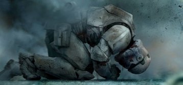
Not sure what it is, but I don't like the look of it as the sleek lines and weapons I normally associate with a stormtrooper are lost with what looks like a brutal weapon designed to rip and crush.
Guess we need to see it in action.
-
Welcome to the FISD
-
Much thanks for the help in making my signature less of a novel and more like what I intended.
-
1
-
-
I went in and took out a lot of double spaces that had popped up, I have seen peoples signature where only the title is visible (and clickable), mine has all the http nonsense tagged on, which looks bad and takes up distracting space.
Other than that, I quite like the new format.
-
I currently have 4 links in my signature to all the bits and pieces I am up to, however I think it looks too big and takes up lots of space......sometimes more than I post in a message.
Could somebody show me or tell me how to reduce it to just a clickable name, rather than the long ramble it currently is :).
Thanks
Art
-
Welcome to the FISD
-
Welcome aboard.
-
Nothing like a BBB and the smell of new armor, welcome to the FISD
-
Welcome to the FISD.
-
1
-
-
Welcome to the FISD
-
Happy BBB day and Welcome to the White
-
1
-
-
Welcome to the FISD
-
Welcome to the FISD
-
Welcome to the FISD
-
Welcome to the FISD
-
Welcome to the white
-
You can never have enough clamps......or magnets
-
Welcome to the FISD.
-
Welcome to the FISD.
-
Nice build, it's coming along nicely
Greetings from NE Wisconsin!
in New Member Introductions Archive
Posted
Hello and Welcome to FISD.